
About the brand
«Matilde» is a premium bakery and coffee house with a sense of place. The new branding was created to give that feeling a clear and lasting expression—one that feels warm, refined, and effortlessly distinctive.
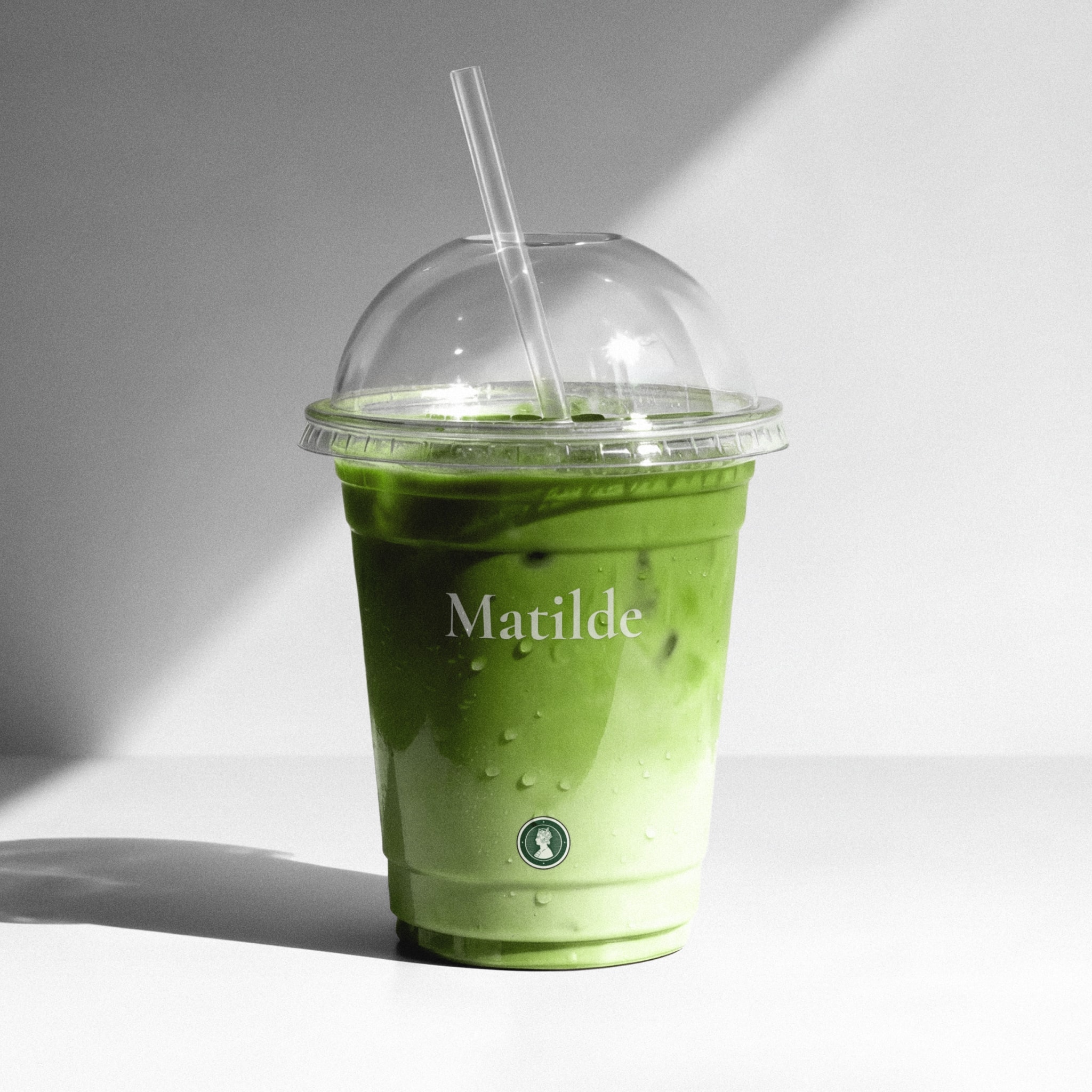
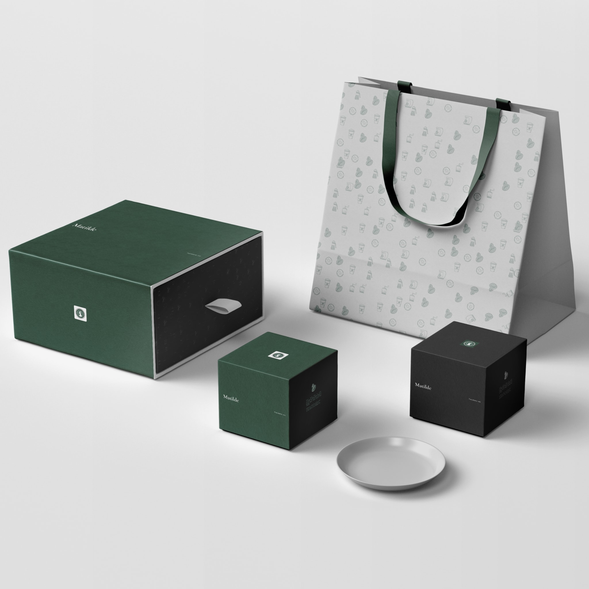
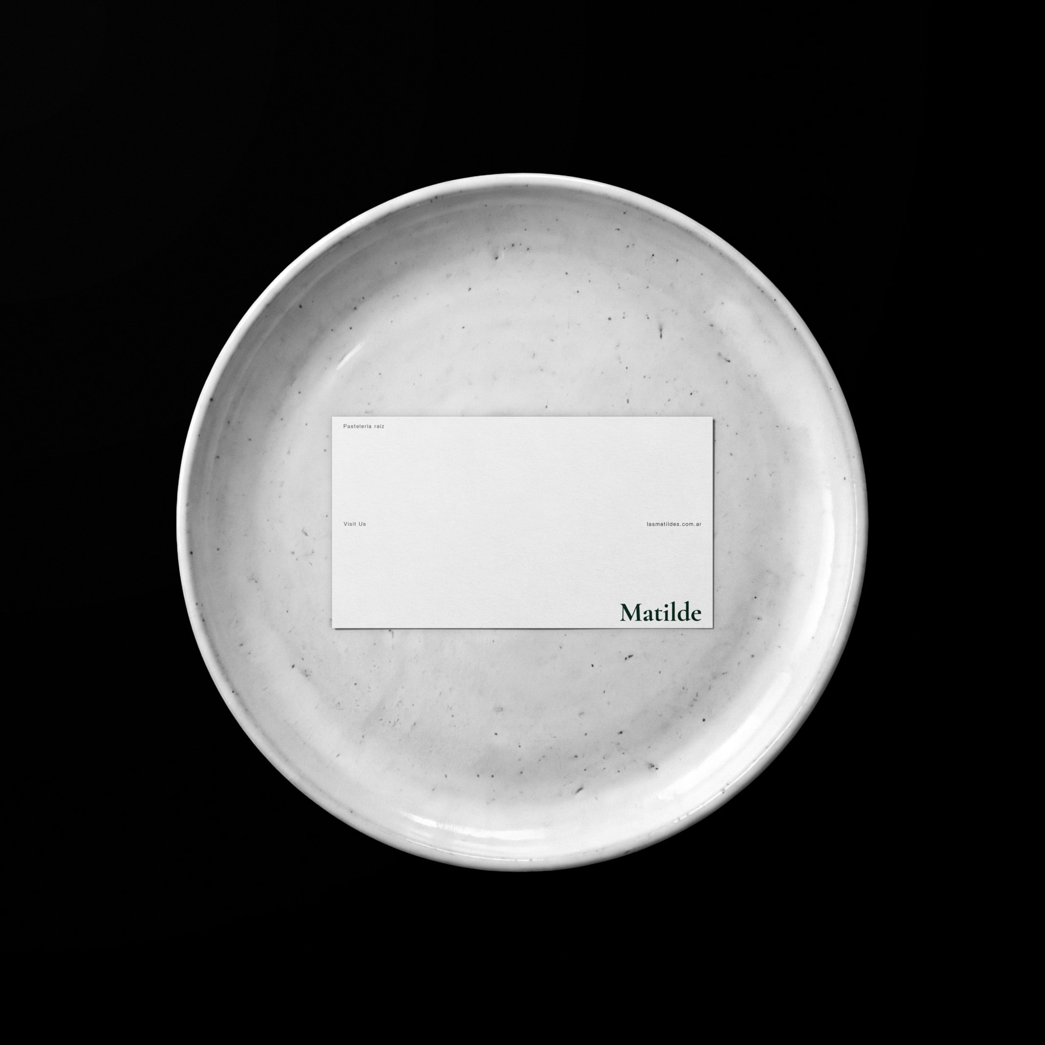
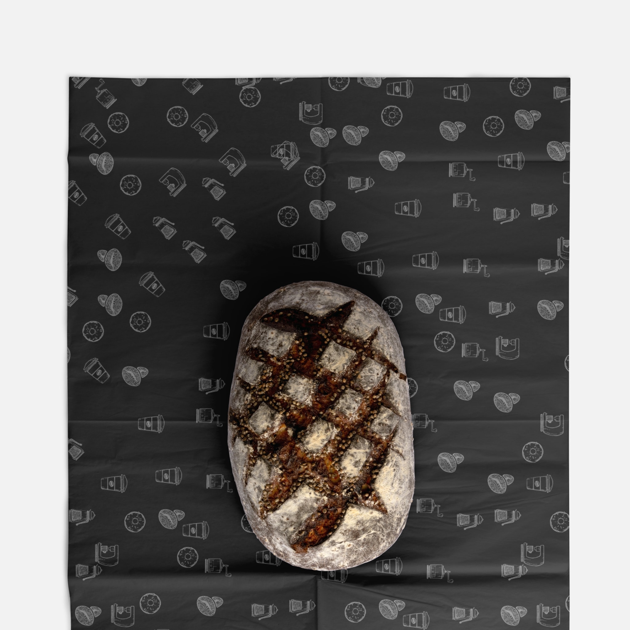
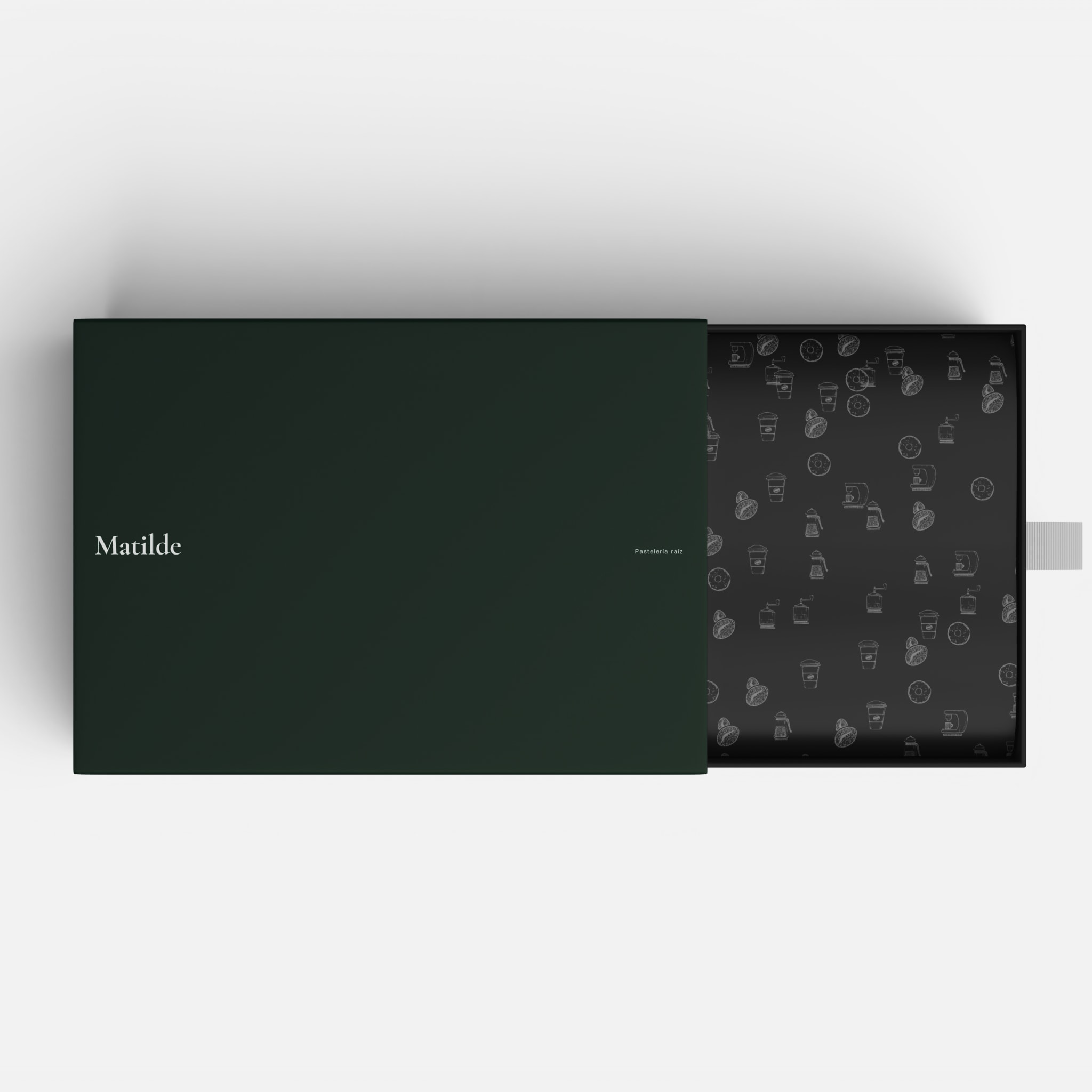
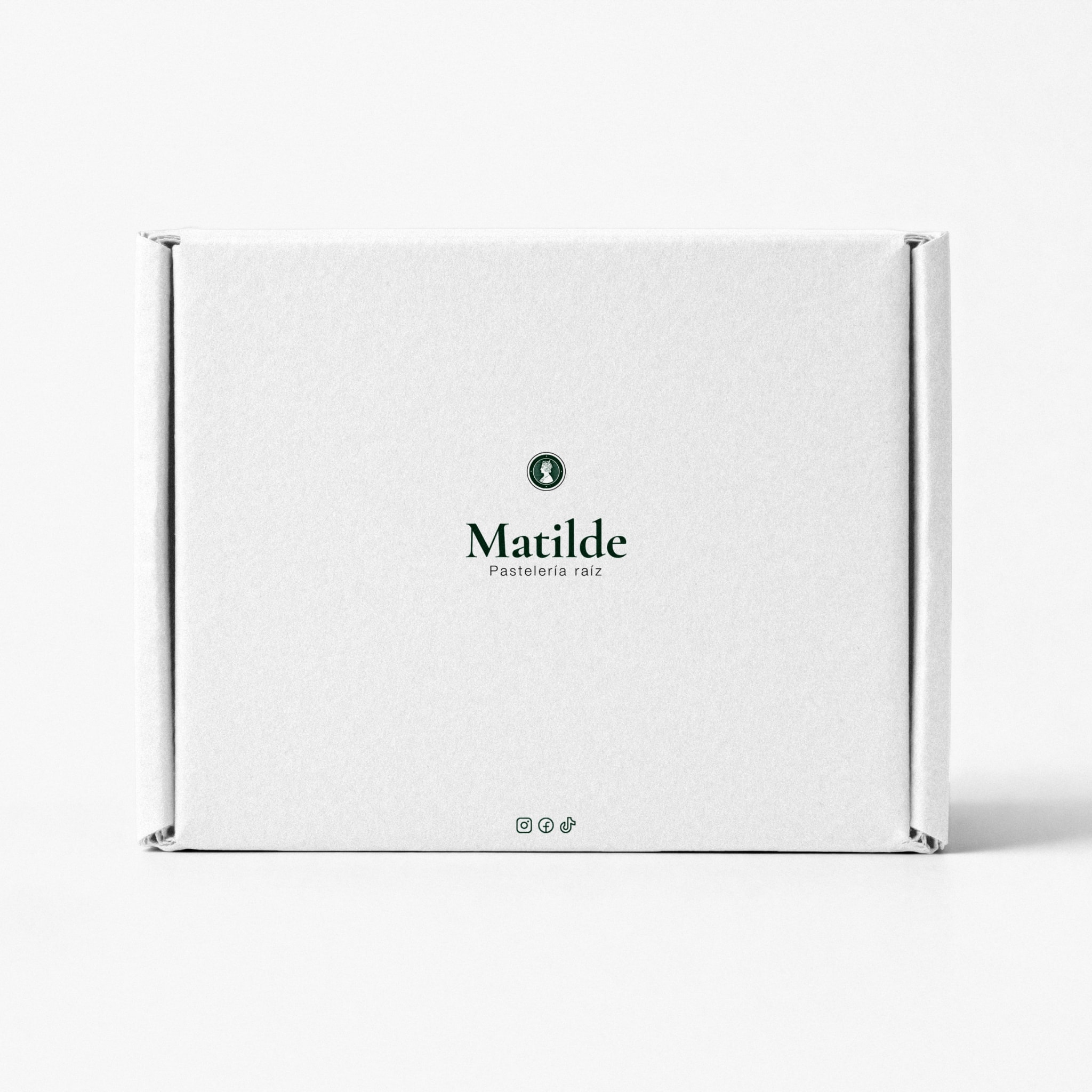
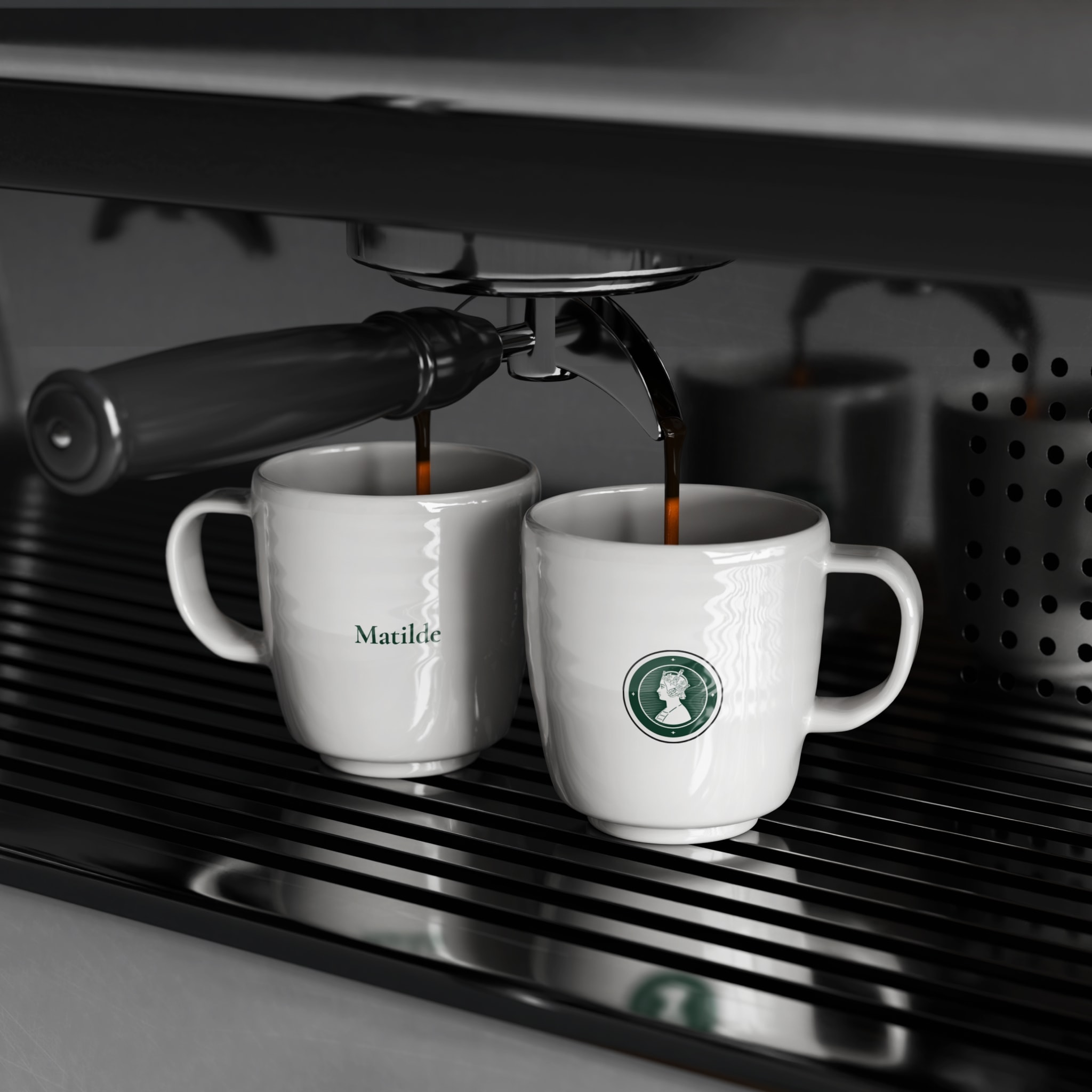
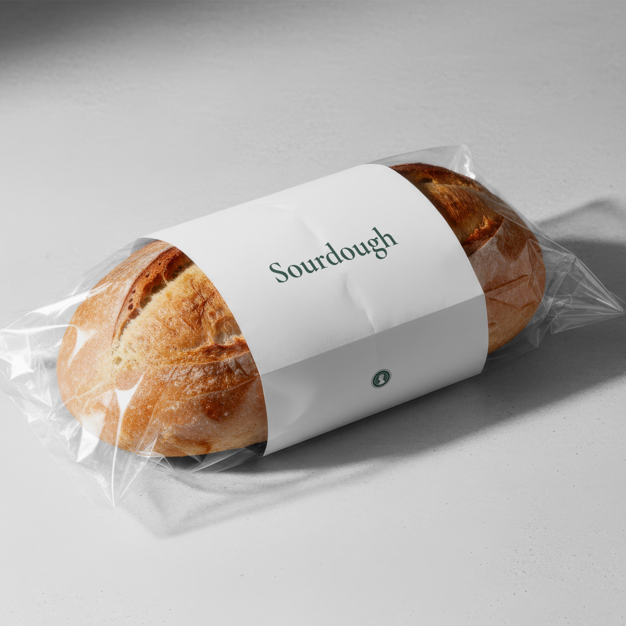
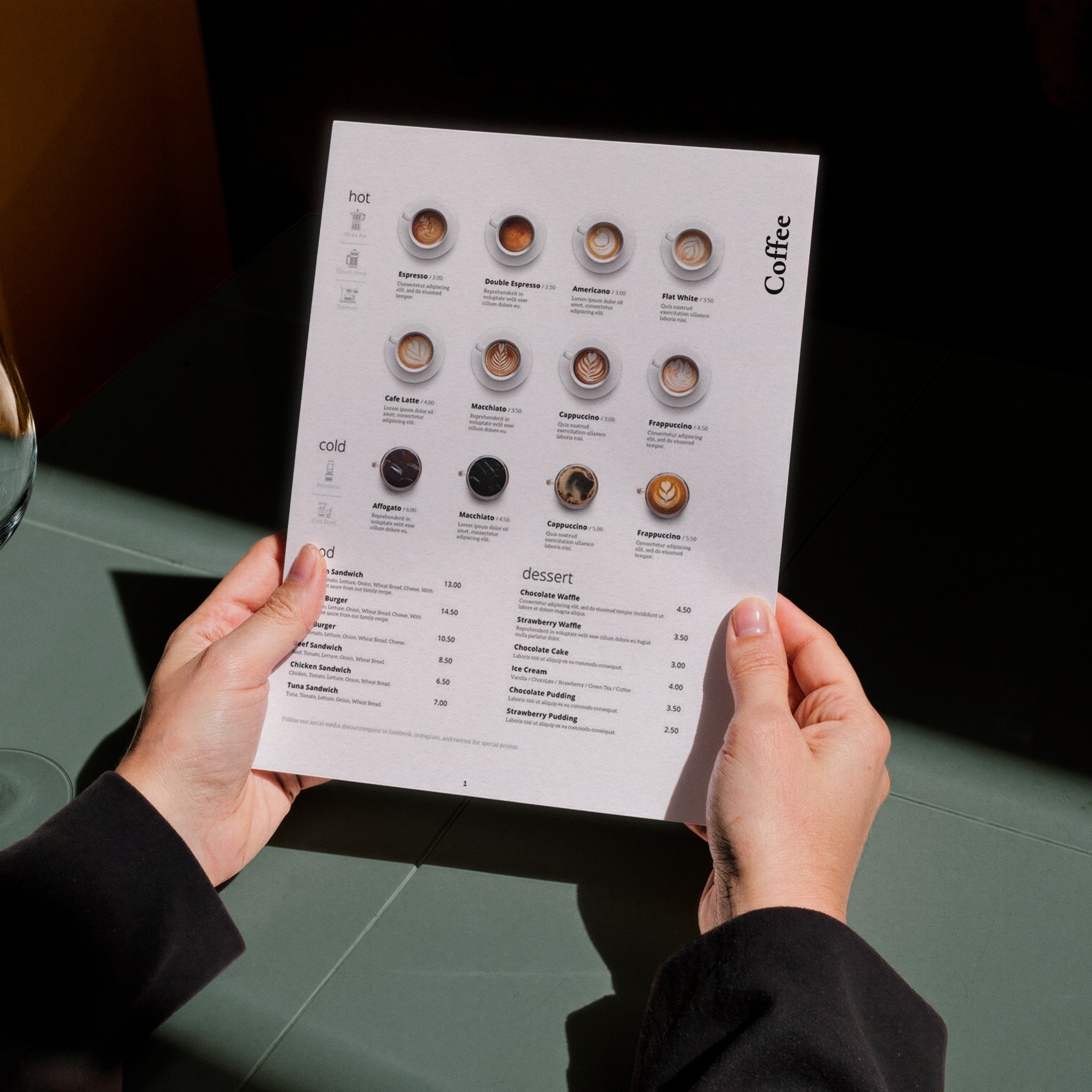
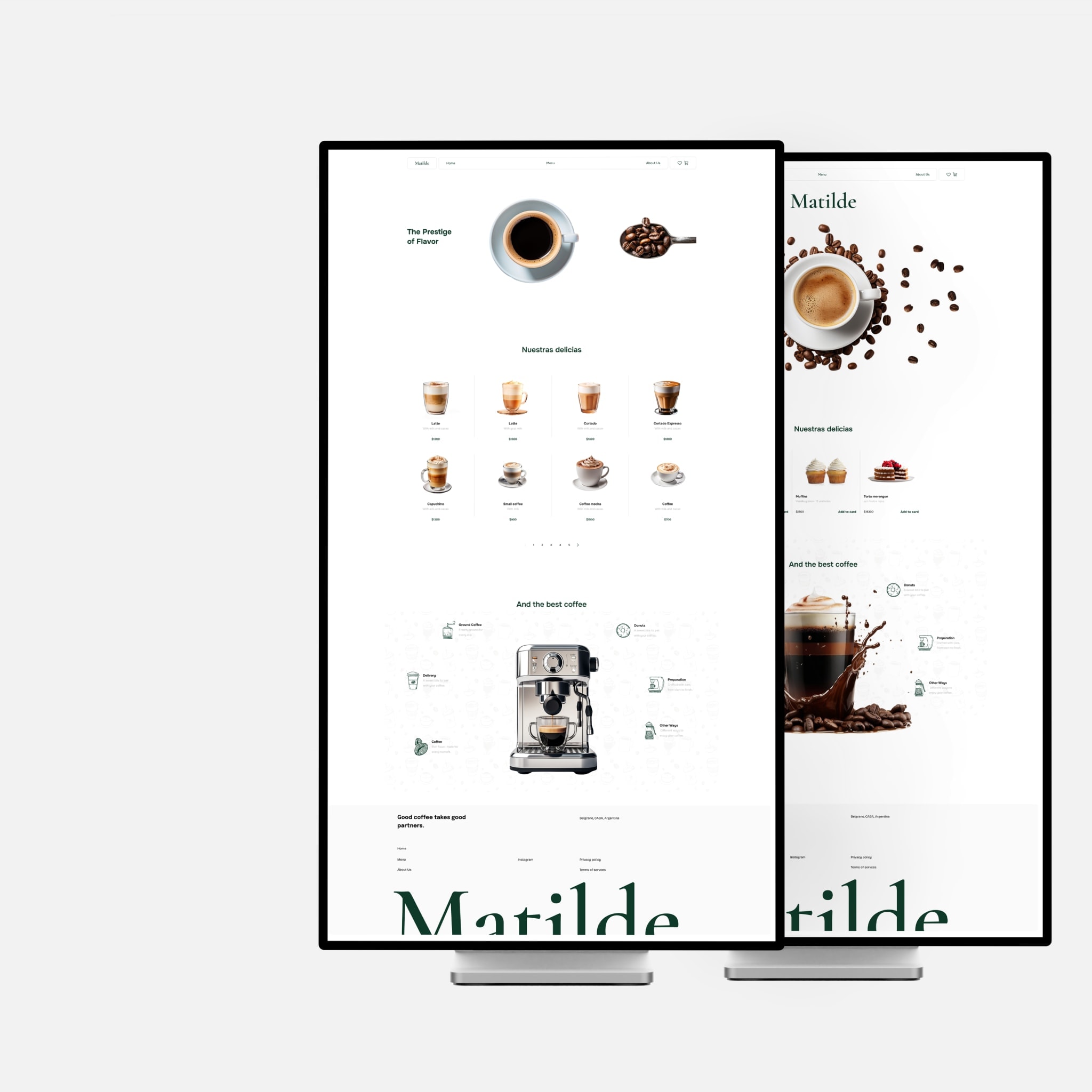
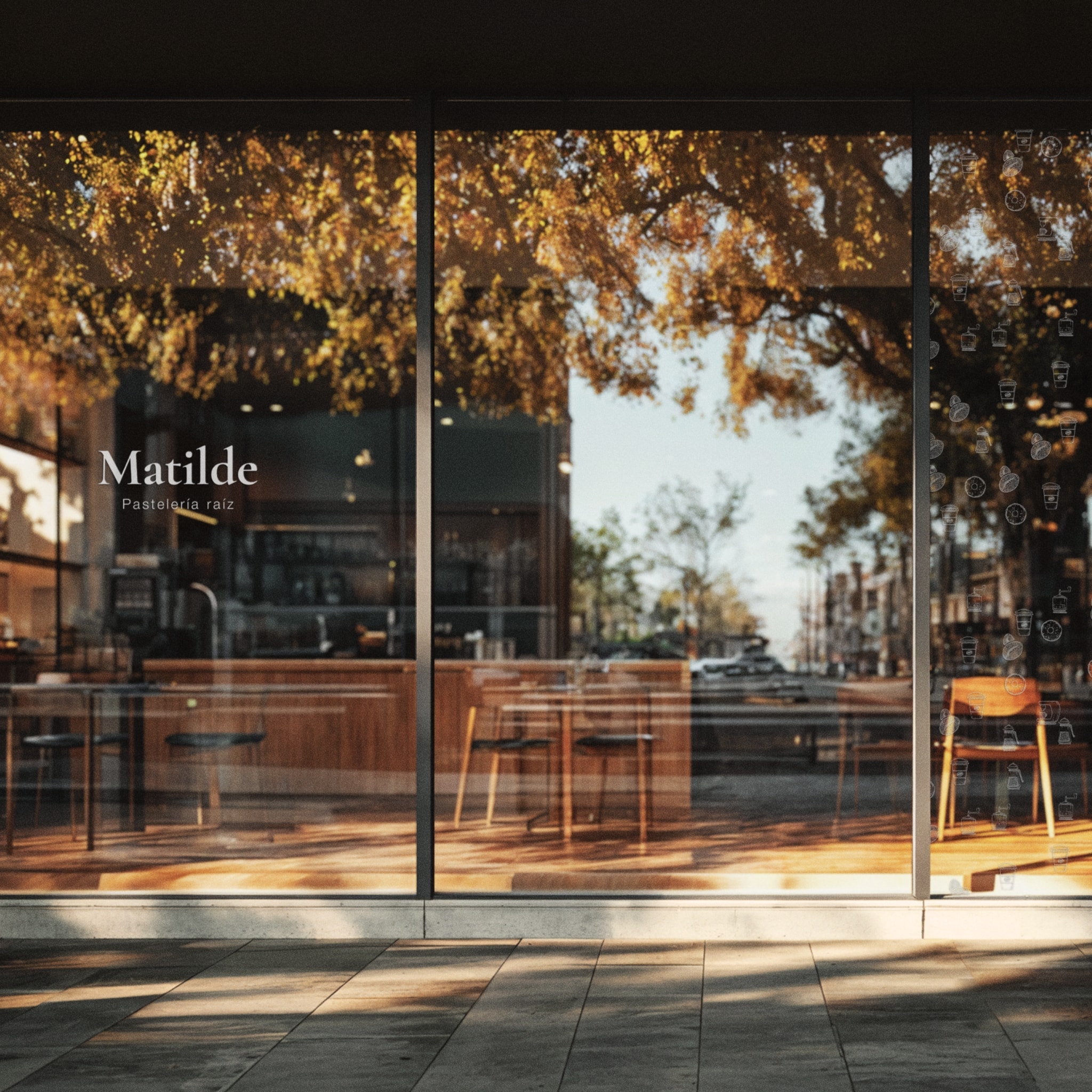
Rather than treating the identity as just a logo, the project developed a visual language that could live naturally across the entire Matilde experience: from the storefront and packaging to menus, coffee cups, and the digital world.
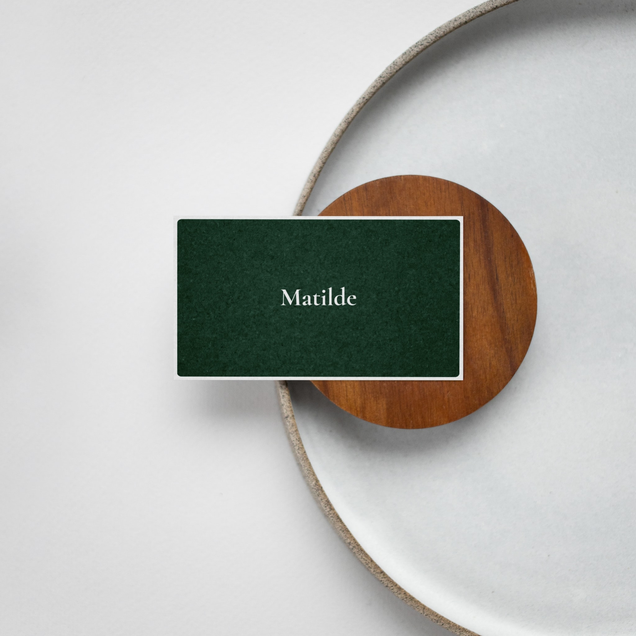
At the heart of the new identity is an engraved portrait, bringing a human and timeless quality to the brand. A considered palette of green and warm paper tones adds depth and familiarity, while a flexible system allows each touchpoint to feel connected without becoming repetitive.
The result is a brand that feels established, personal, and quietly confident—designed to make Matilde memorable without ever trying too hard.
Credits and scope of work
 Julian
Market and brand analysis
Brand strategy
Communication strategy
Branding system
Logo design
Animations
Identification elements
Website structure
Functional mock-ups
Website design
Website implementation
(Framer & AI)
Year 2023