About the brand
«Patitas» is a brand created to make pet care feel simpler, warmer, and more thoughtful. Built around the everyday relationship between people and their pets, its purpose goes beyond offering products or services—it aims to create a trusted brand experience centered on care, companionship, and responsible wellbeing.
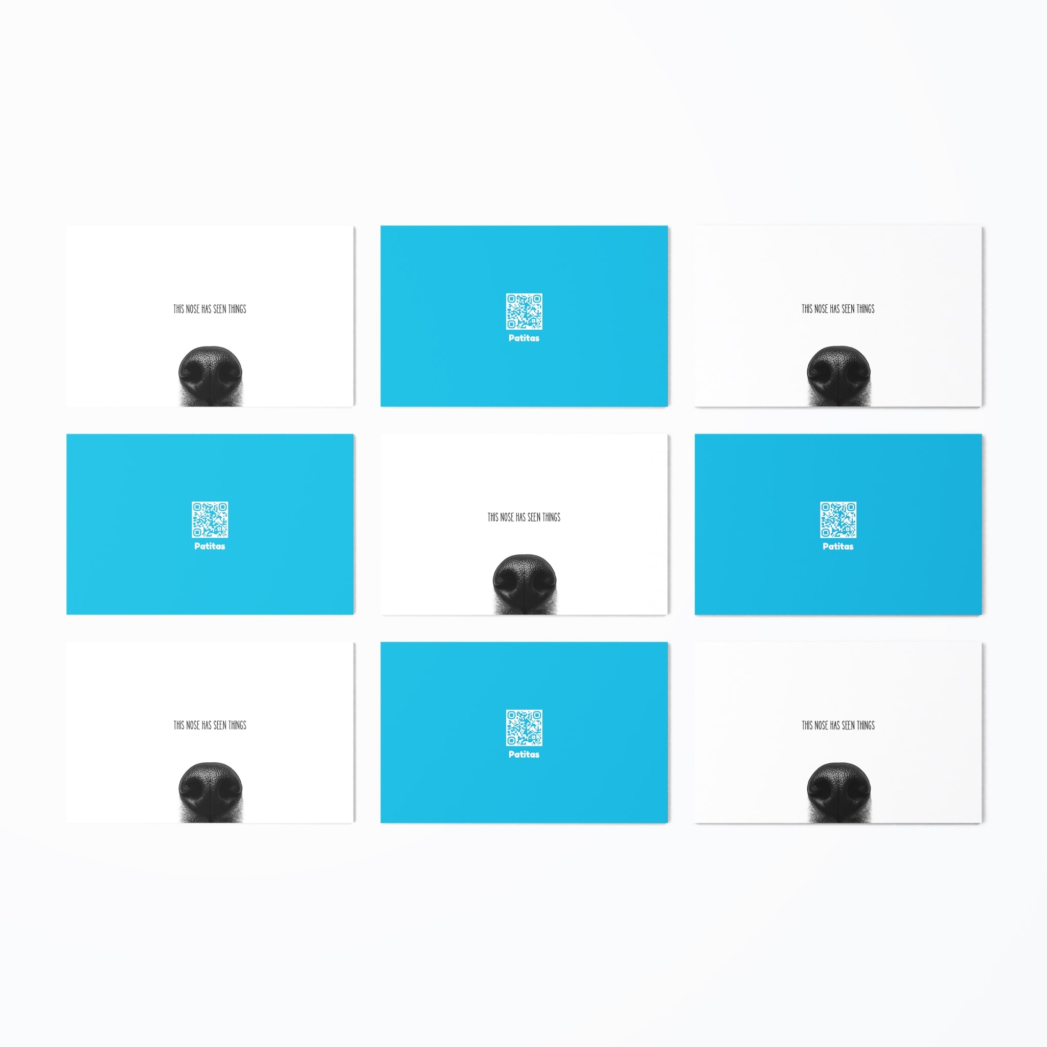
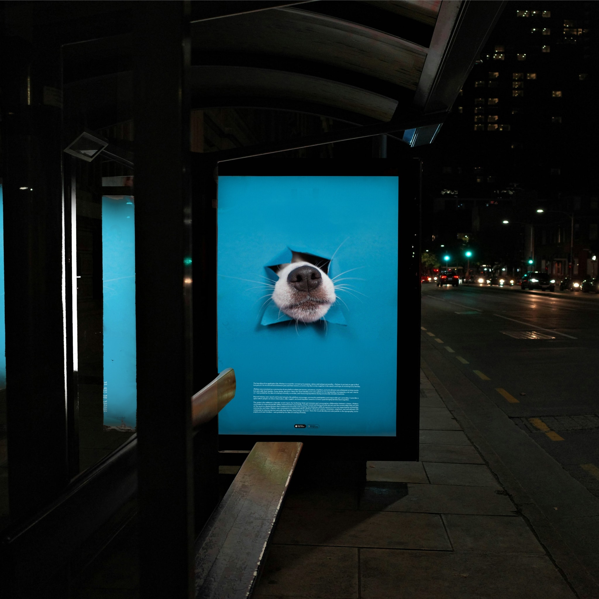
The branding of Patitas was developed with the intention of creating a clear, recognizable, and emotionally meaningful identity within the pet care space. From the very beginning, the goal was to build a brand that communicates trust, empathy, and professionalism while remaining approachable and memorable for pet owners.
The identity was designed to move away from both overly childish pet branding and the cold, clinical aesthetics often associated with veterinary services. Instead, Patitas balances warmth with a refined visual language, creating a contemporary and cohesive brand capable of connecting with pet owners across every touchpoint while establishing itself as a trustworthy companion in the care of their pets.
Credits and scope of work
Julian
Creative director
Product Designer
App design
Brand developer
Brand strategy
Branding system
Website design
Ignacio
App implementation
App developer
Year
2020


Patitas
Location
Paw


Branding strategy
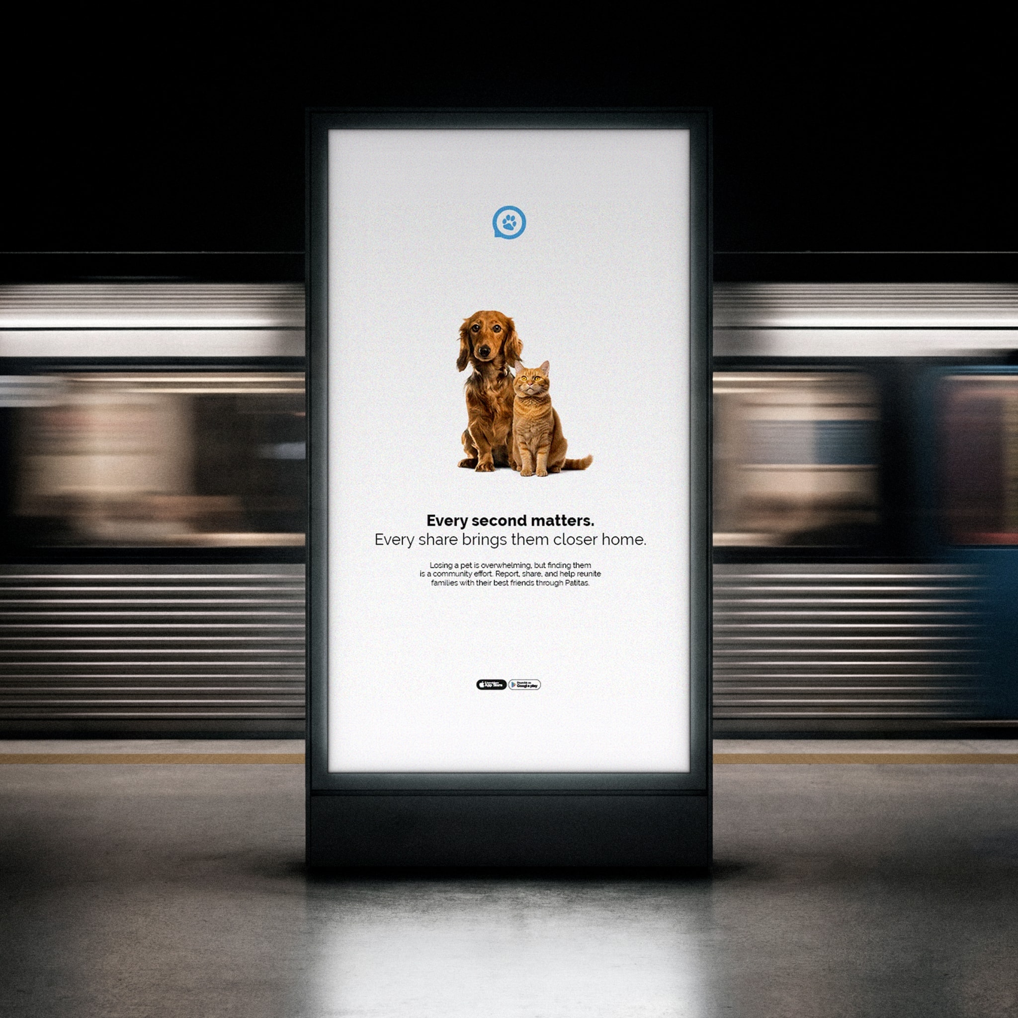
The branding strategy for «Patitas» is built around empathy, trust, and community, creating a visual identity that communicates care while remaining clean, modern, and highly accessible
Every visual element was designed to reinforce the platform’s mission of reconnecting lost pets with their families. Soft, rounded shapes, friendly iconography, and balanced compositions evoke warmth, safety, and companionship, reflecting the emotional bond between pets and their owners.
The identity system is supported by a modern sans-serif typeface that ensures excellent readability across both digital and mobile experiences. Combined with a simple and intuitive visual language, the typography helps comunicate information clearly during situations where speed and clarity are essential.

White
Typography
Details
Uppercase
ABCDEFGHIJKLMNOPQRSTUVWXYZ
Lowercase
abcdefghijklmnopqrstuvwxyz
Numbers
1234567890?!$%,.;:
Patitas sets everything — headlines, interface, running text — in Raleway, keeping Fredoka One for the logotype alone. A neutral, highly legible sans was chosen so an alert stays readable on a phone, at a glance, in the moment it matters.


Page as a foundation of communication
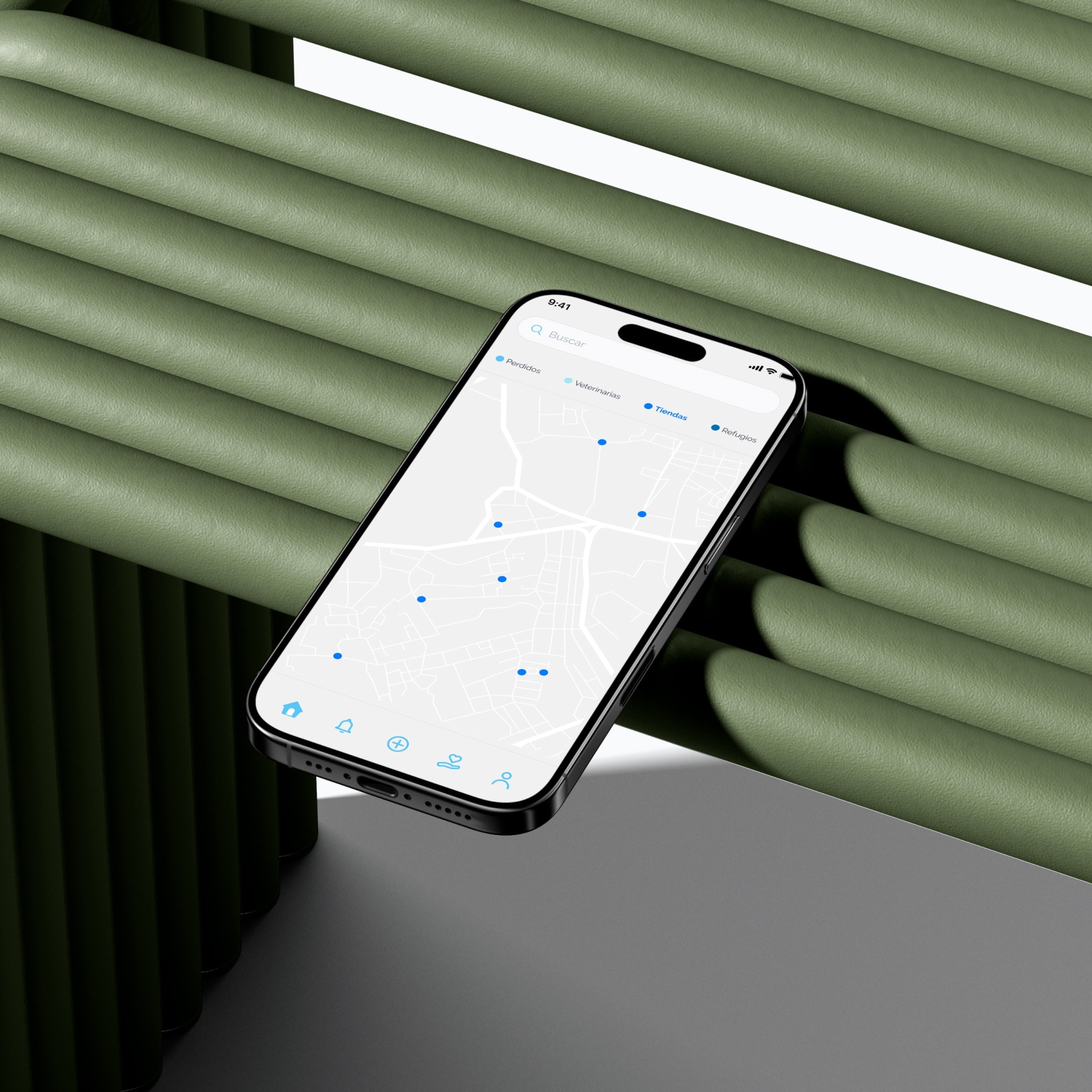
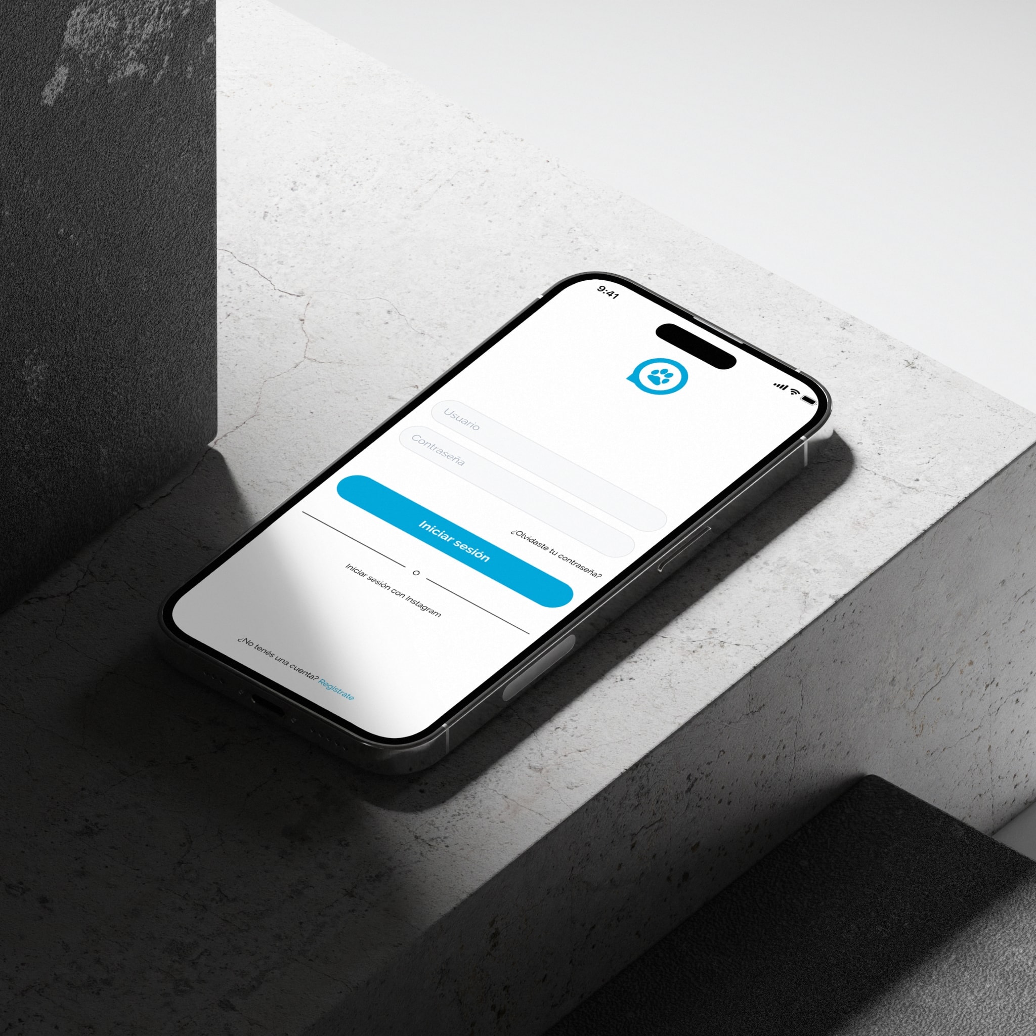
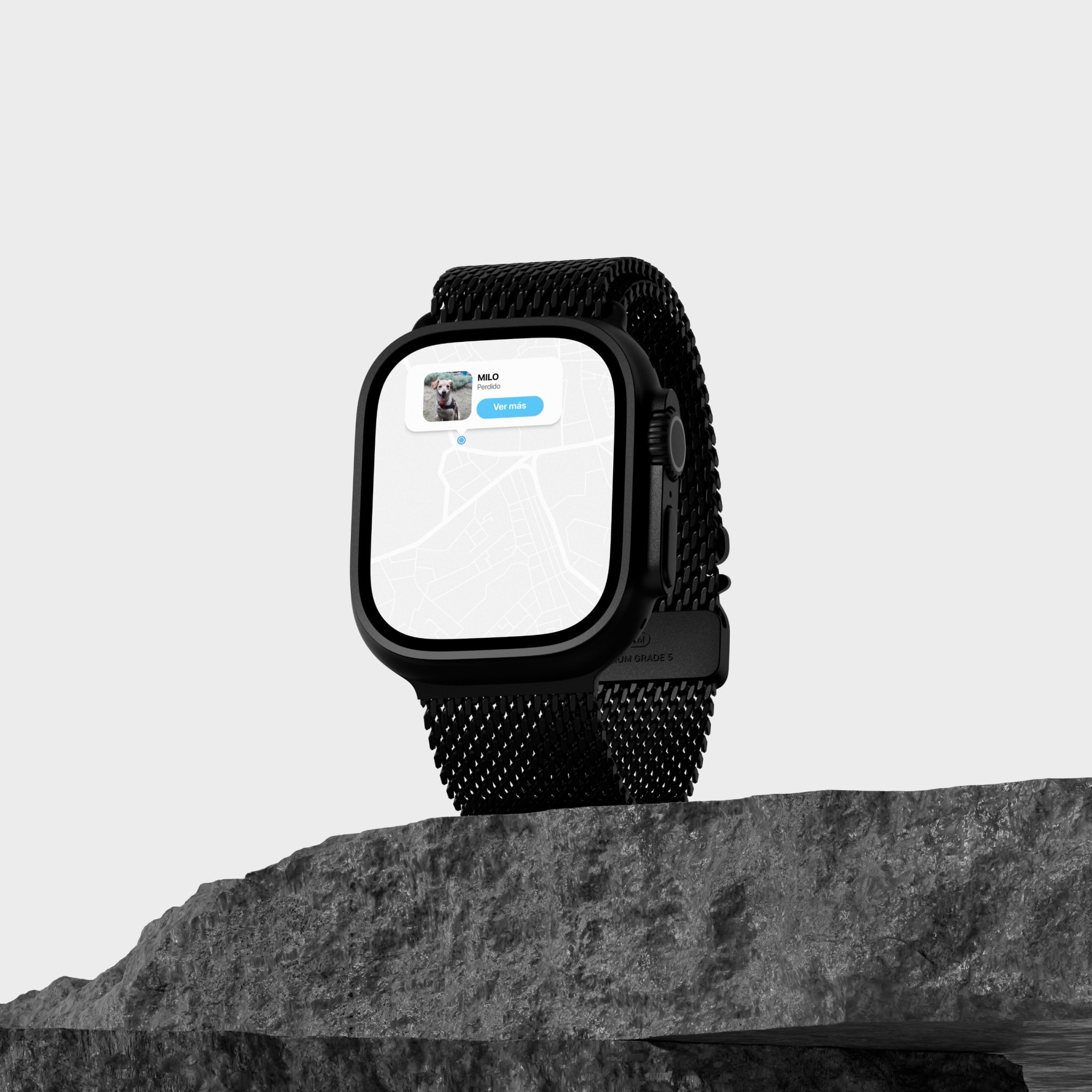
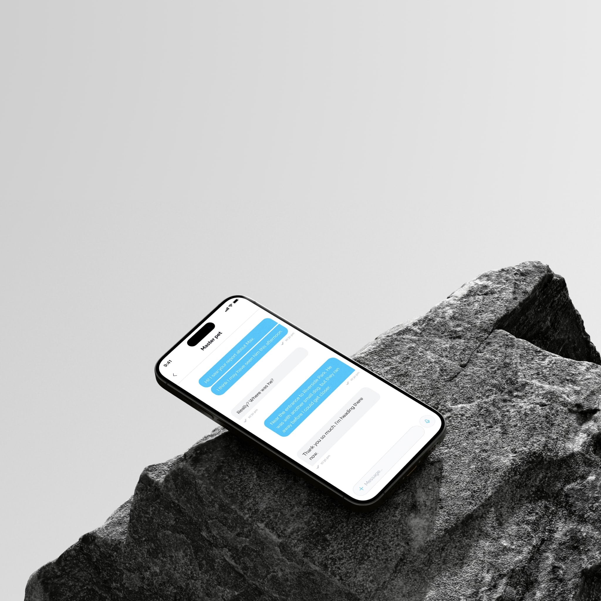
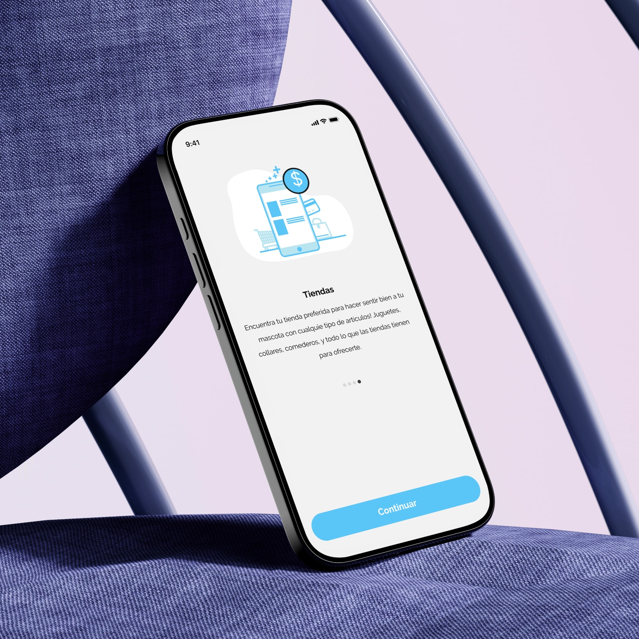
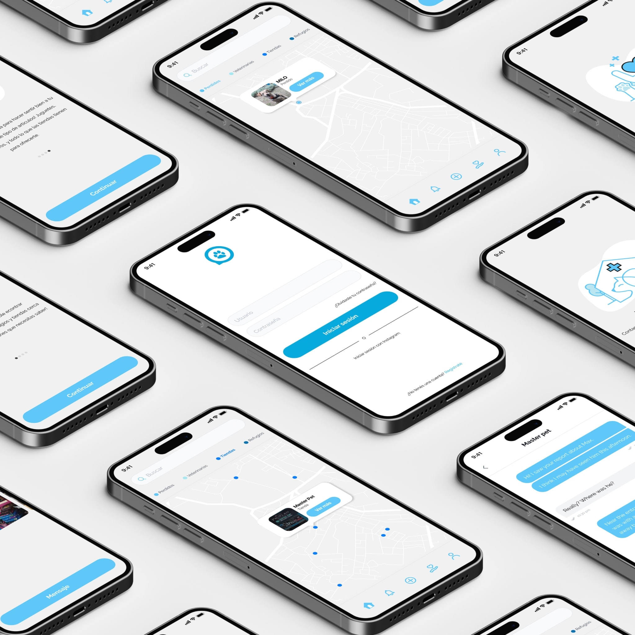
The «Patitas» mobile app was designed to provide a fast, intuitive, and emotionally supportive experience during one of the most stressful situations a pet owner can face: losing a pet. Every screen, interaction, and user flow was carefully crafted to reduce friction and help users take action as quickly as possible.
Built with a mobile-first mindset, Patitas delivers a seamless experience across devices while fostering collaboration between pet owners, volunteers, and local communities. More than a lost pet application, it is a platform that leverages technology to strengthen community support, encourage participation, and increase the chances of reuniting pets with their families.
The color palette is centered around vibrant blue tones, representing trust, reliability, and hope, complemented by neutral colors that maintain clarity and accessibility. Together, these elements create a recognizable and approachable brand that inspires confidence while encouraging people to collaborate in building a stronger community dedicated to helping lost pets find their way home.


